The End of Year Summary has been deprecated. If you have any questions on the previous year's data please submit a Support ticket.
The End of Year Summary is a high-impact reporting tool designed to help you reflect on your team's key performance metrics from the past 12 months. It provides a comprehensive view of productivity, lead engagement, and communication volume, giving you the concrete data needed to plan for growth and set measurable goals. This report is a core component of the Sierra Manager Reporting menu, offering a centralized location for leadership-level analytics.
Table of Contents
Accessing the End of Year Summary
Follow these steps to generate your report:
- Navigate to Reporting: From your dashboard, locate the top navigation bar and click on the Reporting dropdown menu.
- Select Manager Reporting: Click on Sierra Manager Reporting to open the leadership analytics dashboard.
- Choose the Report: Click on End of Year Summary from the list of available report options.
Key Metrics in Your Report
Lead Traffic by Month
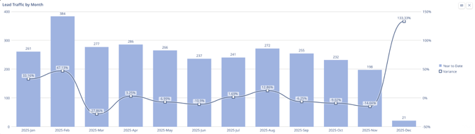
What This Chart Measures
This chart tracks the performance of "Lead Traffic" (potential sales or business opportunities) over the year 2025 using two distinct metrics simultaneously:
-
Volume (The Blue Bars): This measures the actual quantity of leads generated each month. You read these against the numbers on the left vertical axis (0 to 400).
-
Performance/Variance (The Dark Line): This measures how far off the results were from the goal (or from the previous year). It is a percentage showing if the month performed better or worse than expected. You read this against the percentages on the right vertical axis (-50% to 150%).
How to Interpret It
Compare the bar height (total volume) against the trend line (performance vs. goal):
-
Line Above 0%: The business exceeded its target (e.g., February).
-
Line Below 0%: The business missed its target, even if volume appeared steady (e.g., March).
-
The December Anomaly: High variance (+133%) despite extremely low volume potentially reflects holiday impact.
Lead Traffic by Lead Source
What This Table Measures
This table provides a granular breakdown of the origin of your leads for the year 2025. While the previous chart showed how many leads you got, this table explains where they came from.
- Vertical Axis (Rows): Lists the specific marketing channels or sources (e.g., Google PPC, Google Organic, Expired Listings).
- Horizontal Axis (Columns): Tracks performance month-over-month from January to December 2025.
- Data Points: The specific count of leads generated by each source in that specific month.
- Far Right Column: The "LEAD COUNT TOTAL" provides the annual aggregate performance for each individual channel.
How to Interpret It
-
Channel Dominance: Scan the Lead Count Total column. Google PPC (1,293 leads) is the overwhelming driver, outperforming the next source by 3x.
-
Consistency vs. Volatility: Review row trends. Google Organic offers steady volume, whereas sources like Agent Site are erratic and event-driven.
-
Diagnose Declines: The total traffic drop in Sept/Oct correlates directly to a decrease in Google PPC volume (down ~50% from peak), confirming PPC as the central performance lever.
Key Observations
-
Primary: Business is heavily dependent on Paid Ads (PPC).
-
Secondary: Organic Search and Expired Listings provide a stable backup layer.
-
Needs Review: Open Houses generated negligible volume (35 leads/year).
Total Leads Added This Year by Lead Source
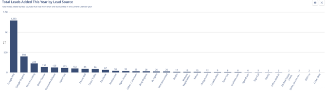
This chart is a cumulative volume analysis for the entire calendar year. unlike the previous table which showed when leads came in, this chart ranks sources by how many total leads they produced. It is essentially a "Leaderboard" of your marketing channels.
-
X-Axis (Horizontal): Every specific source that generated at least one lead, sorted from highest performing to lowest performing.
-
Y-Axis (Vertical): The total count of leads generated.
How to Interpret It
-
Pareto Principle (80/20 Rule): Performance is heavily skewed toward a single source.
-
The Juggernaut: Google PPC (1,293 leads) generates more volume than all other sources combined, indicating a critical dependency on paid ads.
-
Supporting Cast: The next tier (Organic, Expired Listings) provides meaningful support but cannot replace PPC volume.
-
The Long Tail: Sources past rank #6 generate negligible individual volume.
Outbound Communications
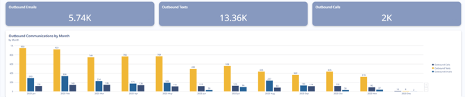
1. The Three Top Scorecards (Aggregate Volume)
What they measure: These three rectangular charts show the cumulative total of outbound activities performed year-to-date. They represent the sheer volume of effort expended by the sales/marketing team.
-
Outbound Emails (5.74K): The total number of emails sent.
-
Outbound Texts (13.36K): The total number of SMS messages sent.
-
Outbound Calls (2K): The total number of phone calls dialed.
How to interpret: These numbers define the "Channel Mix" of your strategy.
- Text-First Strategy: The team relies heavily on texting. The volume of texts (13.36K) is more than double the volume of emails and nearly 7x the volume of phone calls.
- Low Call Volume: With only 2,000 calls made all year (roughly ~160 per month on average), this indicates a "low-touch" or automation-heavy approach rather than an aggressive cold-calling strategy.
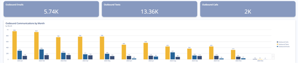
2. The Bar Chart (Outbound Communications by Month)
What it measures: This chart tracks the velocity and consistency of outreach over time. It breaks down the three communication types month-by-month to show when the work was actually done.
-
Yellow Bars (Texts): Consistently the tallest bars, showing text volume per month.
-
Medium Blue Bars (Emails): The middle volume activity.
-
Dark Blue Bars (Calls): The lowest volume activity every single month.
How to interpret: This chart reveals the operational rhythm and potential burnout of the team:
- The Q1 Sprint: Activity was highest in January and February (peaking at ~950 texts and ~336 emails in a single month). This correlates perfectly with the "Lead Traffic" chart analyzed previously, where lead volume peaked in February. The team worked the fresh leads hard.
- The Mid-Year Plateau: From March through May, activity stabilized but stayed relatively high.
- The Q3/Q4 Decline: Starting in June (labeled "2025-Jun"), there is a steady, visible decline in activity across all three channels. By November, text volume dropped to 319 (down ~66% from the January high), and calls dropped to 37.
- December Halt: Similar to the lead generation charts, activity effectively ceased in December.
Inbound Communications
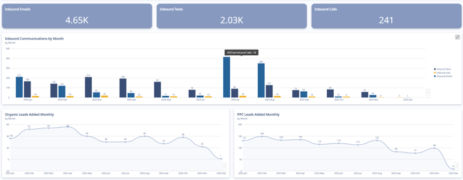
1. The Top Scorecards (Total Volume)
What they measure: These show the total number of times a prospect or client initiated contact this year.
-
Inbound Emails (4.65K): The dominant form of incoming communication.
-
Inbound Texts (2.03K): A distant second place.
-
Inbound Calls (241): Extremely low volume.
Interpretation: There is a "Channel Mismatch" when compared to your Outbound data (from the previous chart).
-
Outbound: You sent 13k Texts and only 5k Emails.
-
Inbound: You received 4.6k Emails and only 2k Texts.
Key Insight: In this example your team prefers to send texts, your customers prefer to reply via email. Sending a follow up via email when texts go unanswered may be beneficial.
2. The Middle Bar Chart (Inbound Velocity)
What it measures: This tracks when customers reached out month-by-month.
-
Light Blue Bars (Emails): Shows the fluctuation in email volume.
-
Dark Blue Bars (Texts): Shows text response volume.
Interpretation:
- The "Summer Spike" Anomaly: Inbound emails surged in July/August despite flat lead volume. This implies the activity came from the existing database (e.g., a newsletter or retargeting campaign) rather than new prospects.
- The Q4 Drop: Inbound responses declined sharply in September–November, mirroring the drop in outbound effort.

3. The Bottom Line Charts (Lead Sources)
These two charts explain who is contacting you by showing the flow of new leads.
Bottom Left: Organic Leads
-
Measure: Free traffic (SEO, word of mouth).
-
Trend: Very low volume (averaging ~30-40/month). It is flat and consistent but represents a small fraction of your total pipeline.
Bottom Right: PPC Leads
-
Measure: Paid traffic (Google Ads).
-
Trend: This is the engine of the business, averaging ~120-140 leads/month in the first half of the year.
Key Insight: The drop in this example explains why your Inbound Communications (the middle chart) dropped in Q4. You stopped feeding the machine with paid leads, so the inbound responses naturally dried up.
Users Created (Month & Role)
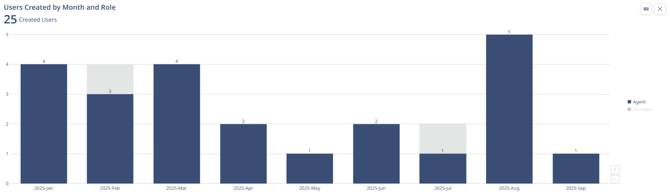
Chart Overview
This chart tracks recruitment and staffing. It shows when new user accounts were added to the system (hiring dates) and distinguishes between two roles:
Interpretation:
-
Q1 Alignment: Aggressive hiring (~12 staff) in Jan–Mar correctly aligned with the year's highest lead volume.
-
The August Mismatch: A major hiring spike occurred in August (5 new Agents) immediately before lead volume and activity crashed in September.
-
The Result: The company increased headcount/overhead at the exact moment the pipeline dried up, leaving new hires with insufficient leads to work.
Recruitment was "barbell shaped" (heavy at the start and end of the period). While the Q1 ramp-up was strategic, the August expansion was ill-timed, resulting in a misalignment between staffing costs and available revenue opportunities.
Getting Support
If you have questions about interpreting your data or navigating the report, we are here to help.
- Live AMA Sessions: Join our experts every Tuesday at 11 AM ET, Wednesday at 1:30 PM ET, or Thursday at 4 PM ET.
- Contact Support: Reach out to our Support Team directly for specific inquiries regarding your account data.
FAQ's
Does the report update dynamically to reflect my current database count?
No, the report tracks the number of leads that were generated in the calendar year. It does not account for leads that were deleted or removed.
Does the report track all call activity - manually logged AND dialer?
Yes! Calls are inclusive of both manually logged and calls placed with the Sierra Dialer.